Data Visualisation Principles
Introduction
Data visualisation plays a crucial role in modern decision-making by transforming complex datasets into accessible visual narratives. In an era where data-driven decisions shape industries, effective visualisations help stakeholders quickly grasp insights and patterns, leading to informed and strategic choices.By turning abstract numbers into visual stories, data visualisation enhances understanding, fosters communication, and drives impactful actions.
In this session we will mostly focus on non-spatial visualisation, but many of the principles also apply to the times when you will be creating maps to be part of your stories.
Why Data Visualisation Matters
The main purposes of enhancing your narrative with data can be categorised into three key areas:
- Facilitating quick understanding of complex information.
- Identifying patterns, trends, and outliers.
- Guiding decision-makers towards strategic actions aligned with your objectives.
Tools and Technologies
Selecting the right tool for the job involves considering several factors, including how you plan to share the visualisations, the need for ongoing maintenance, and your own level of expertise. If the data is likely to change frequently, choosing a tool that supports dynamic updates or easy revisions is crucial. Additionally, the way you share your visualisations—whether through static reports, interactive dashboards, or embedded in web pages—will influence the tool selection. Finally, your own proficiency and familiarity with the tool should be taken into account to ensure efficiency and effectiveness in creating impactful visualisations.
| Category | Tools | Pros | Cons |
|---|---|---|---|
| Classic Spreadsheets | Excel, Google Sheets | Easy to learn and widely accessible | Limited customisation and scalability |
| BI Tools | Tableau, Power BI | Powerful for interactive dashboards and reporting | Can be expensive; requires learning curve for complex tasks |
| Coding Libraries | Python (matplotlib, seaborn), D3.js |
Highly customisable and flexible | Steeper learning curve; requires programming knowledge |
Exploring vs. Presenting
“Don’t run before you can walk”
Start simple and gradually build complexity. In data visualisation, it’s tempting to jump straight to advanced tools or sophisticated designs, but this can lead to confusion and inefficiency if the basics are not well understood. Begin with simple exploratory analyses to understand your data, then progressively refine and enhance your visualisations as your message becomes clearer and your narrative more defined.
Exploratory data visualisation
is about discovering insights, identifying patterns, and asking new questions. It is most useful during the initial stages of data analysis when the goal is to understand the data and its structure. At this stage, it’s not about perfection but about exploration and iteration.
Explanatory data visualisation
on the other hand, is about communicating a specific message or insight clearly to an audience. It involves polishing the visualisation, ensuring accuracy, and crafting a narrative that guides the viewer to the intended conclusion.
Learning when to switch from exploration to presentation is key to managing efforts effectively. Investing time in refining and polishing a visualisation is only worthwhile once the message is clear and impactful.
Principles of Data Visualisation
Gestalt Principles
The Gestalt principles originate from a psychological theory developed by German psychologists in the early 20th century. These principles explain how humans naturally perceive visual elements as organized patterns or wholes, rather than as separate components (see Wagemans 2012). In data visualisation, Gestalt principles help designers arrange information in a way that is easily understood and visually appealing. By leveraging these principles, data visualisations can guide viewers to see relationships, hierarchies, and narratives within the data more intuitively.
| Principle | Description | Example |
|---|---|---|
| Proximity | Elements that are close to each other are perceived as a group. |  |
| Similarity | Items that share visual characteristics are seen as related. |  |
| Continuity | The eye follows lines and curves smoothly without abrupt changes. |  |
| Closure | Incomplete shapes are perceived as complete wholes. |  |
| Connectedness | Items connected by lines or other visual cues are seen as related. |  |
| Colour | Utilises hues and shades to convey meaning and hierarchy. |  |
| White Space | Strategic use of empty space to enhance readability and focus. |  |
These (and many other) principles guide visual perception and interpretation by leveraging the brain’s natural tendencies to group similar elements, follow continuous lines, and fill in gaps to perceive complete shapes. By applying these principles, designers can direct the viewer’s attention, create visual hierarchies, and improve the overall user experience. This strategic arrangement of visual elements not only enhances comprehension but also makes complex data more approachable and meaningful.
Choosing the Right Chart
Matching data types to the most effective visualisation is essential for conveying the intended message clearly and accurately. Different types of data—such as categorical, numerical, and temporal data—require different visualisation approaches to effectively highlight patterns, trends, and relationships.
- Categorical data, which represents discrete groups or categories, is best displayed using bar charts, pie charts, or stacked column charts for comparing proportions or frequencies.
- Numerical data, especially when showing distributions or relationships, is effectively visualised through histograms, scatter plots, or line graphs.
- Temporal data, which involves time series or sequences, is well-suited to line charts or area charts to show trends over time.
Selecting the right chart type enhances the narrative and helps the audience interpret the data more intuitively.
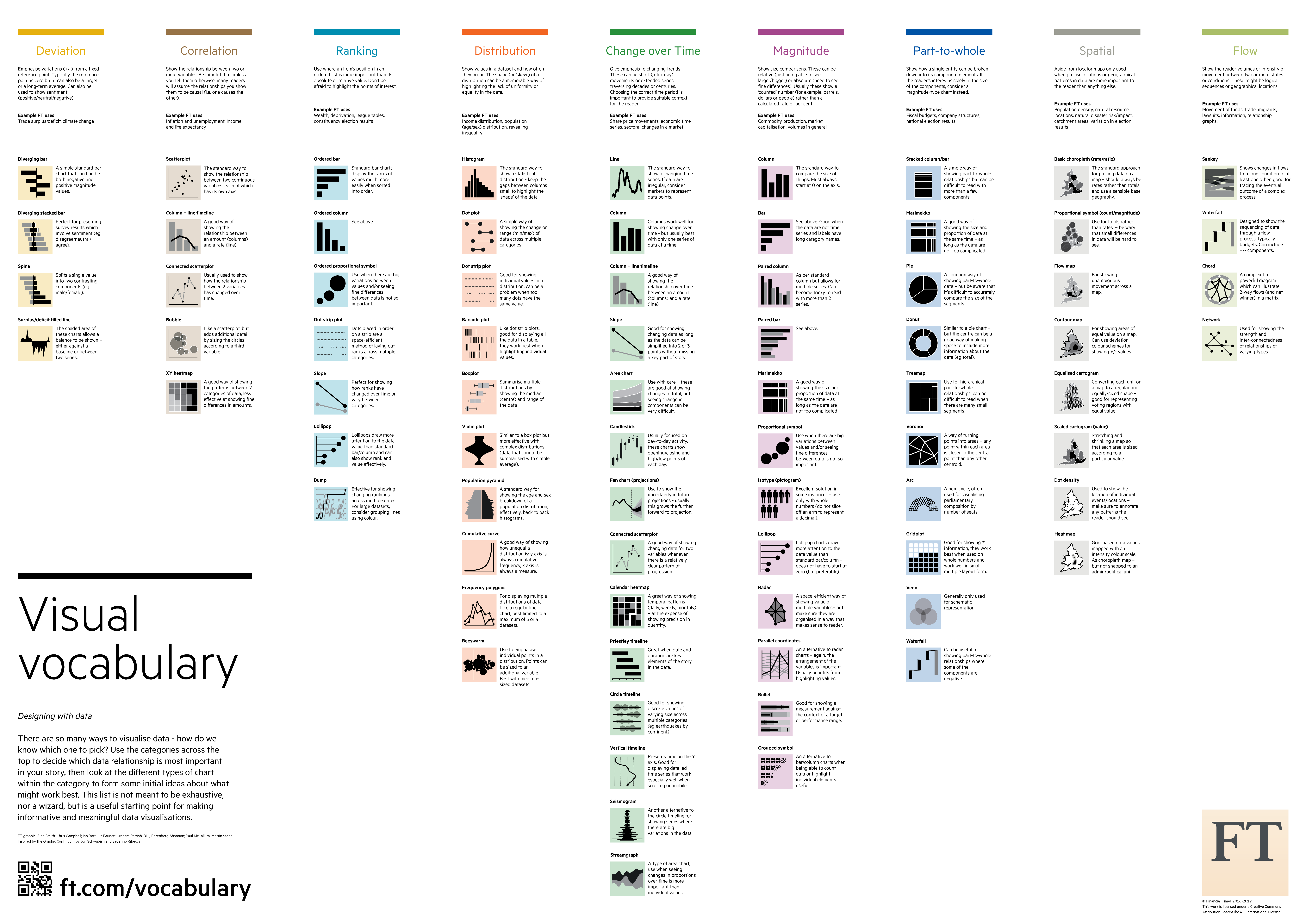
NYTimes Visual Vocabulary is a comprehensive guide for matching data types to appropriate chart styles.
- Clarity and simplicity: Avoid clutter and focus on the message.
- Accuracy and integrity: Represent data truthfully.
- Aesthetics and engagement: Use colors, fonts, and layouts strategically.
- Misleading graphs (e.g., truncated axes, improper scaling).
- Overcomplicating with too much information.
- Choosing the wrong type of visualisation for the data.
Final thoughts
As the field continues to evolve, it is crucial to stay curious and experiment with new tools and techniques. Exploring different visualisation methods can inspire creativity and enhance your storytelling abilities. Today’s session is design to start visualising data today and adopt a flexible mindset for continuous improvement.
References
- Wagemans, J., Elder, J. H., Kubovy, M., Palmer, S. E., Peterson, M. A., Singh, M., & von der Heydt, R. (2012). A century of Gestalt psychology in visual perception: I. Perceptual grouping and figure–ground organization. Psychological Bulletin, 138(6), 1172–1217. https://doi.org/10.1037/a0029333